Extensive research in different methods / Low & Hi Fid Prototype
year
2023
/02
Amazon
Redesign An Amazon's Single Item Landing Page
Project Overview
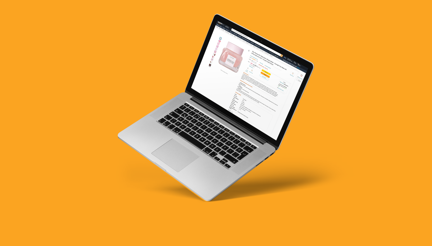
Enhancing Amazon's Single Item Landing Page (Glow recipe mini watermelon sleeping mask page): Elevating Online Shopping Experience and Driving Purchase Intentions.
Background
Amazon is one of the world’s largest online retailers (marketplace) with annual net income of 33,364 million USD by 2021(Statista, 2023). Amazon has at least 31,040 worldwide consumers who shop online at least once a month from age group of 16 years and older (Statista, 2023).
Problem statement
The current layout of Amazon's full-screen product page poses challenges for new visitors in effectively exploring the products, potentially leading to key metrics that hinder the company from achieving its business objectives. In this case study, I aim to optimise the individual product page and check out process, focusing on improving user experience and increasing purchasing intentions.
Why is this a problem?
According to CPC Strategy (2018), 67 percent of Amazon shoppers prefer to shop using their desktop computer or laptop. Hence, prioritising the desktop product page becomes our main focus, surpassing the importance of the mobile app.
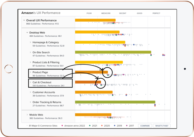
Based on Baymard Institute's evaluation in 2022, Amazon's UX performance data reveals that the website's product page and checkout experience are rated as poor to mediocre when compared to other aspects like on-site research, order tracking, and returns, which are rated as achieving perfect performance.
According to Colleen M. Harmeling, Alexander Bleier and Roberr W. Palmatier in 2019, a single design element on an Amazon product page, when used effectively, can increase purchase intentions up to 10% which is a substantial amount in today’s competitive online retail landscape.
Goals
User friendly design
Improve item page design and layout
Boost user engagement
Drive more sales and and elevate customer satisfaction
Solution
My primary focus was on redesigning the glow recipe sleeping mask landing page I selected from Amazon.
The solution involved diving into discovery research, survey, user interviews, competitive analysis and ideation workshop to analyse the results and identify main pain points and develop effective solutions to create a better user experience especially for new Amazon's customers.
The outcome was an aesthetically captivating landing page that offers seamless navigation. By consistently prioritising user needs during the design and research phases, I crafted a landing page that not only addressed initial concerns but also enhanced user experiences through strategic reorganisation of the layout – fulfilling users' desires beyond their immediate expectations!
DISCOVER
Desktop Research
Desktop research was conducted to look into Amazon's product page UX performance, surveys, interviews and competitors to gain an understanding of the problem space.
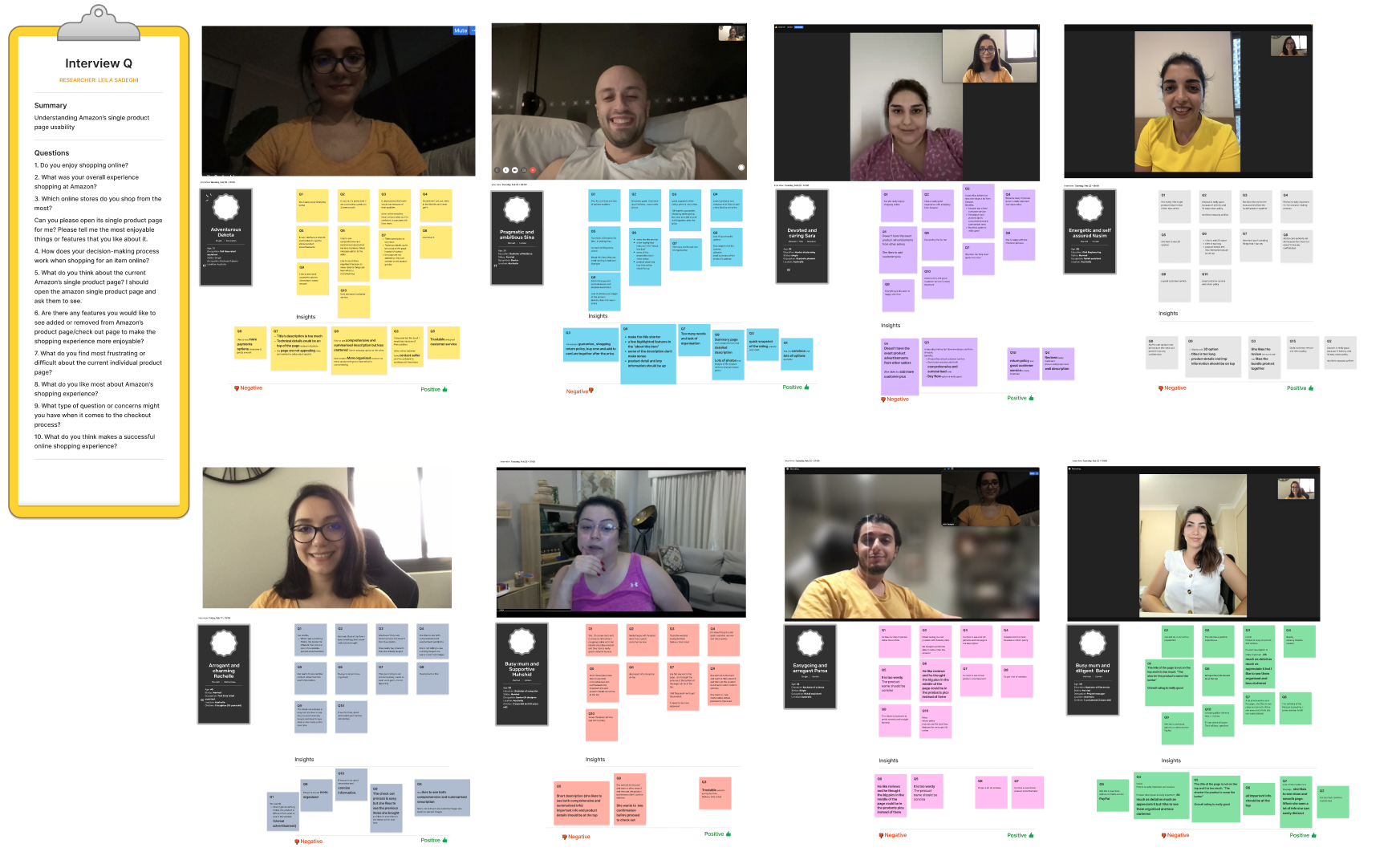
1:1 Interview
8 x 1:1 interviews
Online Survey
A total of 23 survey responses were collected from individuals ranging in age from 15 to 55+
Competitor analysis
Deep research into organisations like eBay, Target, Costco, and Alibaba
8 people were interviewed and their negative and positoive thoughts were collected
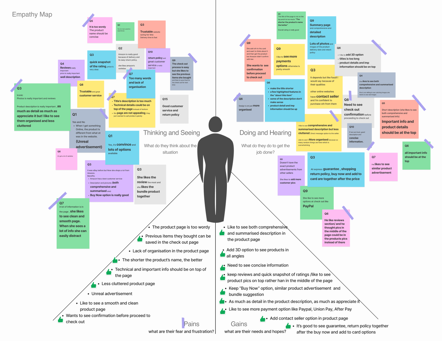
This is an Empathy Map which depicts users pains and gains
User Research Highlights
DEFINE
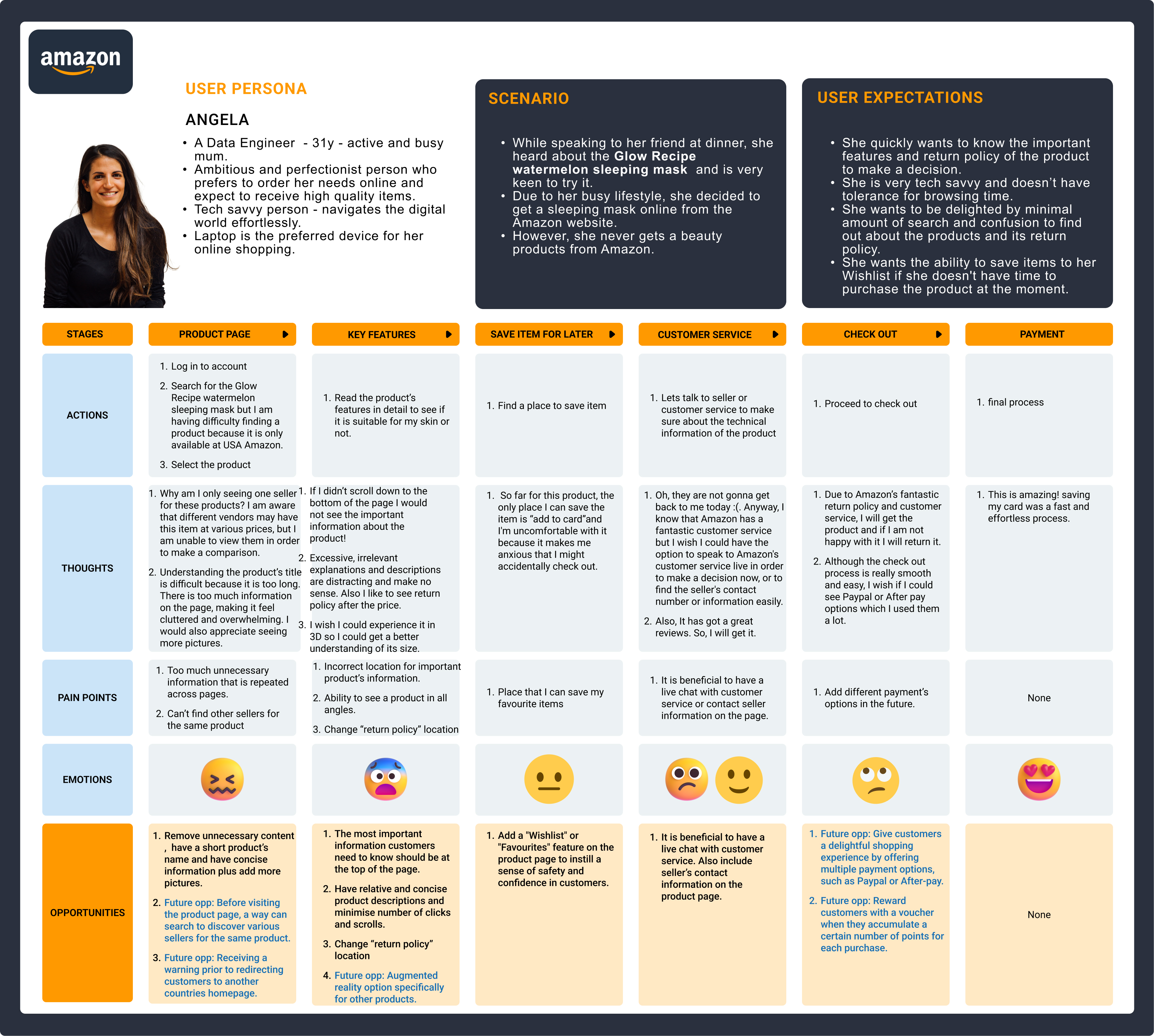
Meet Our Persona
Insights uncovered through research synthesis were used to develop a key persona representing a prospective candidate for Amazon.
Journey Map
A journey map was developed to show Angela's frustrations and get a sense of how we could assist her to have a better user experience with Amazon.
Angela's Pain Points
Remove unnecessary content in product description and have a short product's title
Relocate the most important information, technical details description and return policy from bottom of the page to top of the page
Add Wishlist button
Angela's Wish Lists
Add a live chat customer service
Add different payment options like PayPal and After pay
Reward customers with a voucher when they accumulate a number of points for each purchase
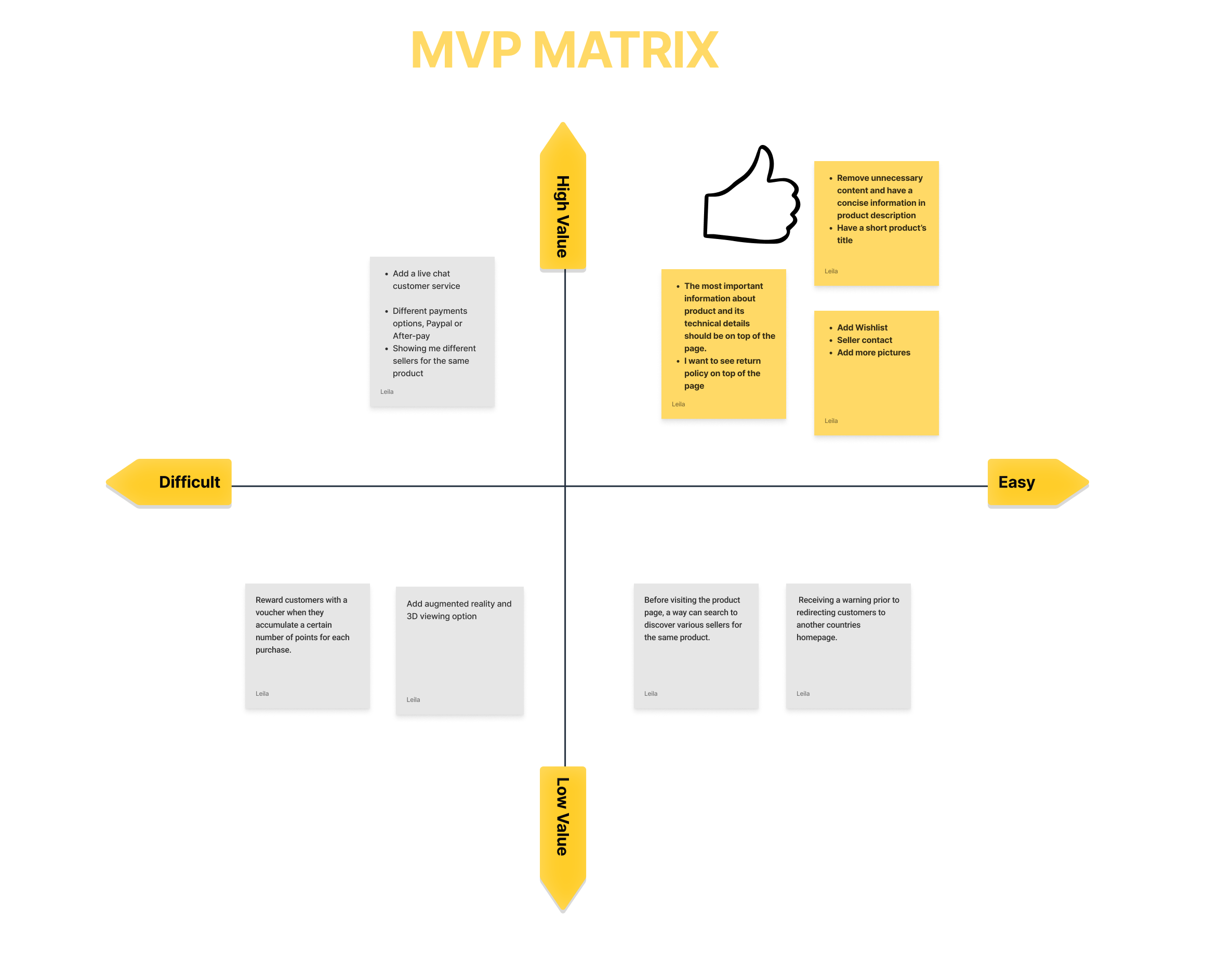
Key features to consider
The initial problem statement aimed at optimising the individual product page and checkout process. After conducting thorough desktop research, collecting data, and understanding user needs, we found that Angela doesn't encounter any issues with the checkout process. Instead, she expressed specific pain points and priorities when making a purchase on Amazon. Consequently, we prioritised Angela's pain points and expectations based on the Minimum Viable Product (MVP) diagram.
IDEATE
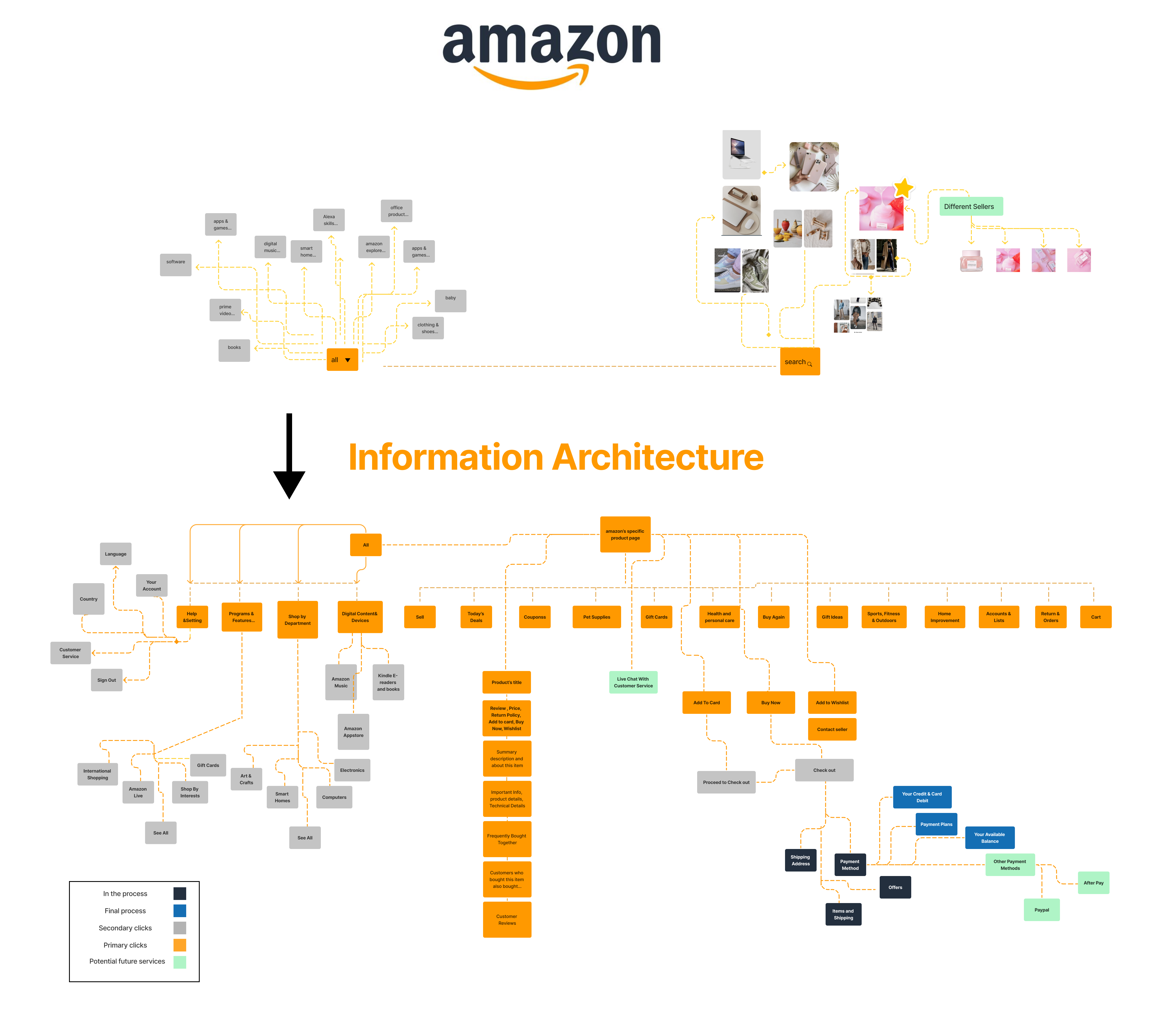
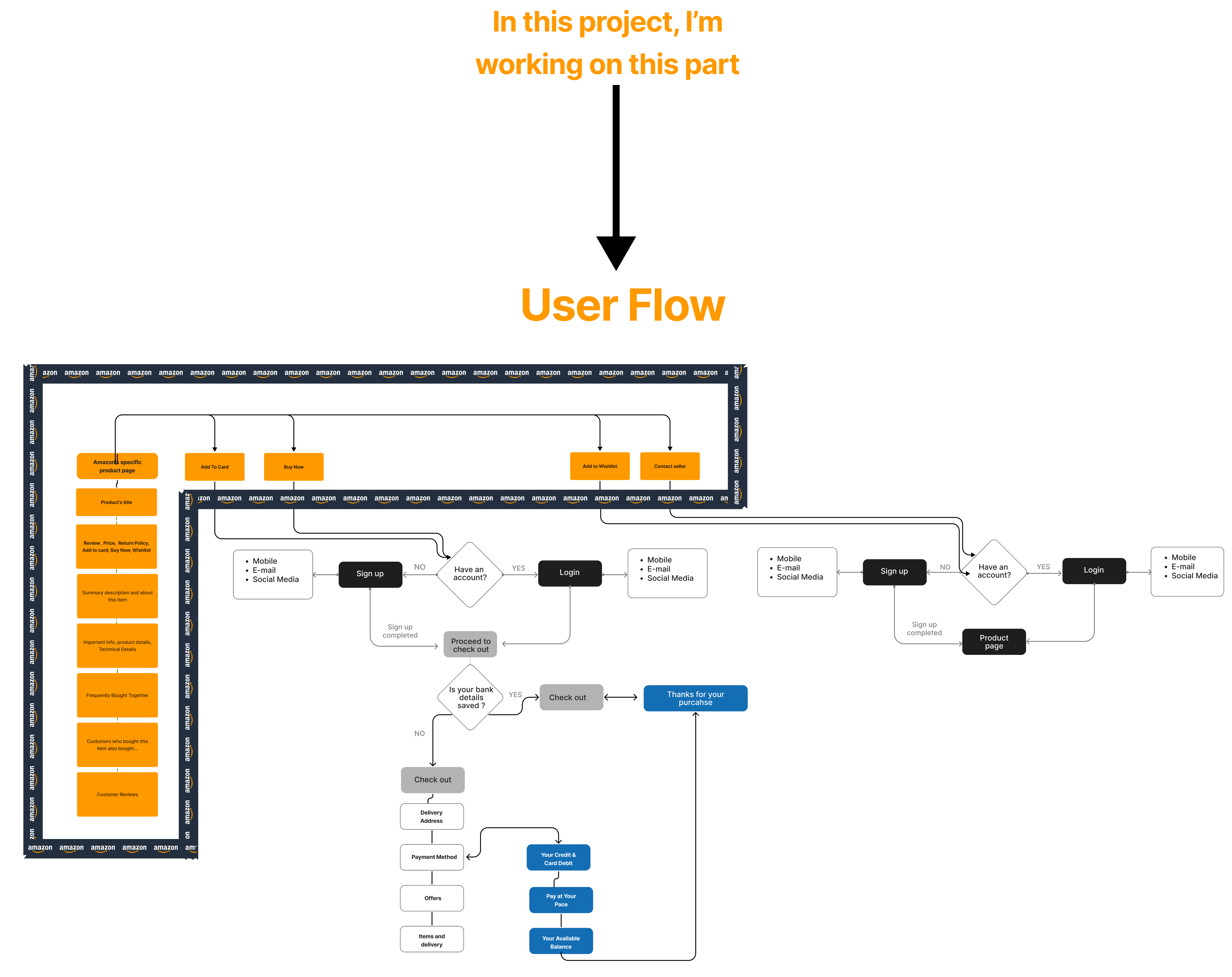
Information Architecture & User Flow
I have taken Angela's needs and goals into consideration and compiled them into one key user flow. Creating a user flow helps me to map out steps a user will take to complete her goal in the most efficient manner.
DELIVER
Prototype and Test
Low - Fidelity Prototype & Usability Testing:
After gathering solid ideas using Angela's needs and MVP diagram, I started build wireframes using Figma. I made sure to prioritise features that would best address of the Angela's needs and expectations. After drafting the testing script,I recruited 5 participants to test my low - fidelity prototype.
User Testing Feedback
4/5 people said it's easier than before to navigate the product page
4/5 people said they can easily find all important information about the product on top of the page
5/5 people said they prefer this less clustered design
Hi - Fidelity Prototype
When asked during my initial user interviews in the research phase, users disclosed that they are more likely to make a purchase on desktop device, the testing were conducted visa Zoom screen sharing using a Figma prototype on desktop device.
Test Objectives: Gather feedback on the entire process and identify usability and accessibility issues.
Participants: 5 people total, a mix of designers, doctors, managers and online shopping lovers.
Key Finings From User Testing Feedbacks
100%
Task Completion Rate
All participants can easily complete the given task
Users enjoy the look of the product landing page more than before
They can easily navigate important information they need to see about the product and its return policy
60%
Appreciates Seeing Different Options as a Value-Add
Live chat customer service
Add augmented reality specially for home products
Reward customers when they accumulate points
FINAL THOUGHTS
Learning & takeaways
Overall, I really enjoyed this experience and learned a lot about online shopping user experiences and e-commerce UX.
Key takeaways:
Prioritising user needs and conducting thorough research led to the development of an aesthetically captivating landing page, resulting in positive feedback from users who found it easier to navigate and access crucial product information.
Strategic layout reorganization, achieved through ideation and competitive analysis, created a less clustered design that resonated well with users, leading to a seamless and improved browsing experience.
The redesigned landing page positively impacted users' purchase intentions, with many expressing a preference for the new layout, potentially contributing to achieving Amazon's business objectives.
FUTURE PATHWAY
Since the customer did not encounter issues with the checkout process, we can allocate more emphasis on the live chat support and customer rewards program, which can contribute to a positive user experience and further enhance customer satisfaction.
Enhanced Customer Support: Integrate a live chat customer service feature to provide prompt and personalised assistance, improving customer satisfaction and fostering engagement.
Customer Rewards Program: Implement a points-based rewards system, rewarding customers with vouchers for each purchase, fostering loyalty and incentivizing continued engagement with the platform.
Hence, our future pathway can centre around the options I mentioned above.
Redesign An Amazon's Single Item Landing Page
Project Overview
Enhancing Amazon's Single Item Landing Page (glow recipe mini watermelon sleeping mask page): Elevating online shopping experience and driving purchase intentions.
Background
Amazon is one of the world's largest online retailers (marketplace) with annual income of 33,364 million USD by 2021 (Statista, 2023). Amazon has at least 31.040 worldwide consumers who shop online at least once a month from age group of 16 years and older (Statista, 2023).
Problem Statement
The current layout of Amazon's full-screen product page poses challenges for new visitors in effectively exploring the products, potentially leading to key metrics that hinder the company from achieving its business objectives. In this case study, I aim to optimise the individual product page and check out process, focusing on improving user experience and increasing purchasing intentions.
Why is this a problem?
According to CPC Strategy (2018), 67 percent of Amazon shoppers prefer to shop using their desktop computer or laptop. Hence, prioritising the desktop product page becomes our main focus, surpassing the importance of the mobile app.
Based on Baymard Institute's evaluation in 2022, Amazon's UX performance data reveals that the website's product page and checkout experience are rated as poor to mediocre when compared to other aspects like on-site research, order tracking, and returns, which are rated as achieving perfect performance.
According to Colleen M. Harmeling, Alexander Bleier and Roberr W. Palmatier in 2019, a single design element on an Amazon product page, when used effectively, can increase purchase intentions up to 10% which is a substantial amount in today’s competitive online retail landscape.
Goals
User friendly design
Improve item page design and layout
Boost user engagement
Drive more sales and and elevate customer satisfaction
Solution
My primary focus was on redesigning the glow recipe sleeping mask landing page I selected from Amazon.
The solution involved diving into discovery research, survey, user interviews, competitive analysis and ideation workshop to analyse the results and identify main pain points and develop effective solutions to create a better user experience especially for new Amazon's customers.
The outcome was an aesthetically captivating landing page that offers seamless navigation. By consistently prioritising user needs during the design and research phases, I crafted a landing page that not only addressed initial concerns but also enhanced user experiences through strategic reorganisation of the layout – fulfilling users' desires beyond their immediate expectations!
DISCOVER
Desktop Research
Desktop research was conducted to look into Amazon's product page UX performance, surveys, interviews and competitors to gain an understanding of the problem space.
1:1 Interview
8 x 1:1 interviews
Online Survey
A total of 23 survey responses were collected from individuals ranging in age from 15 to 55+
Competitor analysis
Deep research into organisations like eBay, Target, Costco, and Alibaba
8 people were interviewed and their negative and positoive thoughts were collected
This is an Empathy Map which depicts users pains and gains
User Research Highlights
DEFINE
Meet Our Persona
Insights uncovered through research synthesis were used to develop a key persona representing a prospective candidate for Amazon.
Journey Map
A journey map was developed to show Angela's frustrations and to get a sense of how we could assist her to have a better user experience with Amazon.
Angela's Pain Points
Remove unnecessary content in product description and have a short product's title
Relocate the most important information, technical details description and return policy from bottom of the page to top of the page
Add Wishlist button
Angela's Wish Lists
Add a live chat customer service
Add different payment options like PayPal and After pay
Reward customers with a voucher when they accumulate a number of points for each purchase
Key features to consider
The initial problem statement aimed at optimising the individual product page and checkout process. After conducting thorough desktop research, collecting data, and understanding user needs, we found that Angela doesn't encounter any issues with the checkout process. Instead, she expressed specific pain points and priorities when making a purchase on Amazon. Consequently, we prioritised Angela's pain points and expectations based on the Minimum Viable Product (MVP) diagram.
IDEATE
Information Architecture & User Flow
I have taken Angela's needs and goals into consideration and compiled them into one key user flow. Creating a user flow helps me to map out steps a user will take to complete her goal in the most efficient manner.
DELIVER
Prototype and Test
Low - Fidelity Prototype & Usability Testing
After gathering solid ideas using Angela's needs and MVP diagram, I started build wireframes using Figma. I made sure to prioritise features that would best address of the Angela's needs and expectations. After drafting the testing script,I recruited 5 participants to test my low - fidelity prototype.
User Testing Feedback
4/5 people said it's easier than before to navigate the product page
4/5 people said they can easily find all important information about the product on top of the page
5/5 people said they prefer this less clustered design
Hi - Fidelity Prototype
When asked during my initial user interviews in the research phase, users disclosed that they are more likely to make a purchase on desktop device, the testing were conducted visa Zoom screen sharing using a Figma prototype on desktop device.
Test Objectives: Gather feedback on the entire process and identify usability and accessibility issues.
Participants: 5 people total, a mix of designers, doctors, managers and online shopping lovers.
Key Finings From User Testing Feedbacks
100%
Task Completion Rate
All participants can easily complete the given task
Users enjoy the look of the product landing page more than before
They can easily navigate important information they need to see about the product and its return policy
60%
Appreciates Seeing Different Options as a Value-Add
Live chat customer service
Add augmented reality specially for home products
Reward customers when they accumulate points
FINAL THOUGHTS
Learning & takeaways
Overall, I really enjoyed this experience and learned a lot about online shopping user experiences and e-commerce UX.
Key takeaways:
Prioritising user needs and conducting thorough research led to the development of an aesthetically captivating landing page, resulting in positive feedback from users who found it easier to navigate and access crucial product information.
Strategic layout reorganization, achieved through ideation and competitive analysis, created a less clustered design that resonated well with users, leading to a seamless and improved browsing experience.
The redesigned landing page positively impacted users' purchase intentions, with many expressing a preference for the new layout, potentially contributing to achieving Amazon's business objectives.
FUTURE PATHWAY
Since the customer did not encounter issues with the checkout process, we can allocate more emphasis on the live chat support and customer rewards program, which can contribute to a positive user experience and further enhance customer satisfaction.
Enhanced Customer Support: Integrate a live chat customer service feature to provide prompt and personalised assistance, improving customer satisfaction and fostering engagement.
Customer Rewards Program: Implement a points-based rewards system, rewarding customers with vouchers for each purchase, fostering loyalty and incentivizing continued engagement with the platform.
Hence, our future pathway can centre around the options I mentioned above.
.png)


%20(2).png)